Oscar Bluemner was a German and an American, a trained architect who read voraciously in art theory, color theory, and philosophy, a writer of art criticism both in German and English, and, above all, a practicing artist. Bluemner was an intense man, who sought to express and share, through drawing and painting, universal emotional experience. Undergirded by theory, Bluemner chose color and line for his vehicles; but color especially became the focus of his passion. He was neither abstract artist nor realist, but employed the “expressional use of real phenomena” to pursue his ends. (Oscar Bluemner, from unpublished typescript on “Modern Art” for Camera Work, in Bluemner papers, Archives of American Art, Smithsonian Institution, as cited and quoted in Jeffrey R. Hayes, Oscar Bluemner [1991], p. 60. The Bluemner papers in the Archives [hereafter abbreviated as AAA] are the primary source for Bluemner scholars. Jeffrey Hayes read them thoroughly and translated key passages for his doctoral dissertation, Oscar Bluemner: Life, Art, and Theory [University of Maryland, 1982; UMI reprint, 1982], which remains the most comprehensive source on Bluemner. In 1991, Hayes published a monographic study of Bluemner digested from his dissertation and, in 2005, contributed a brief essay to the gallery show at Barbara Mathes, op. cit.. The most recent, accessible, and comprehensive view of Bluemner is the richly illustrated, Barbara Haskell, Oscar Bluemner: A Passion for Color, exhib. cat. [New York: Whitney Museum of American Art, 2005.])
Bluemner was born in the industrial city of Prenzlau, Prussia, the son and grandson of builders and artisans. He followed the family predilection and studied architecture, receiving a traditional and thorough German training. He was a prize-winning student and appeared to be on his way to a successful career when he decided, in 1892, to emigrate to America, drawn perhaps by the prospect of immediate architectural opportunities at the Chicago World’s Fair, but, more importantly, seeking a freedom of expression and an expansiveness that he believed he would find in the New World.
The course of Bluemner’s American career proved uneven. He did indeed work as an architect in Chicago, but left there distressed at the formulaic quality of what he was paid to do. Plagued by periods of unemployment, he lived variously in Chicago, New York, and Boston. At one especially low point, he pawned his coat and drafting tools and lived in a Bowery flophouse, selling calendars on the streets of New York and begging for stale bread. In Boston, he almost decided to return home to Germany, but was deterred partly because he could not afford the fare for passage. He changed plans and direction again, heading for Chicago, where he married Lina Schumm, a second-generation German-American from Wisconsin. Their first child, Paul Robert, was born in 1897. In 1899, Bluemner became an American citizen. They moved to New York City where, until 1912, Bluemner worked as an architect and draftsman to support his family, which also included a daughter, Ella Vera, born in 1903.
All the while, Oscar Bluemner was attracted to the freer possibilities of art. He spent weekends roaming Manhattan’s rural margins, visiting the Bronx, Brooklyn, Queens, and New Jersey, sketching landscapes in hundreds of small conté crayon drawings. Unlike so many city-based artists, Bluemner did not venture out in search of pristine countryside or unspoiled nature. As he wrote in 1932, in an unsuccessful application for a Guggenheim Fellowship, “I prefer the intimate landscape of our common surroundings, where town and country mingle. For we are in the habit to carry into them our feelings of pain and pleasure, our moods” (as quoted by Joyce E. Brodsky in “Oscar Bluemner in Black and White,” p. 4, in Bulletin 1977, I, no. 5, The William Benton Museum of Art, Storrs, Connecticut). By 1911, Bluemner had found a powerful muse in a series of old industrial towns, mostly in New Jersey, strung along the route of the Morris Canal.
While he educated himself at museums and art galleries, Bluemner entered numerous architectural competitions. In 1903, in partnership with Michael Garven, he designed a new courthouse for Bronx County. Garven, who had ties to Tammany Hall, attempted to exclude Bluemner from financial or artistic credit, but Bluemner promptly sued, and, finally, in 1911, after numerous appeals, won a $7,000 judgment.
Barbara Haskell’s recent catalogue reveals more details of Bluemner’s architectural career than have previously been known. Bluemner the architect was also married with a wife and two children. He took what work he could get and had little pride in what he produced, a galling situation for a passionate idealist, and the undoubted explanation for why he later destroyed the bulk of his records for these years. Beginning in 1907, Bluemner maintained a diary, his “Own Principles of Painting,” where he refined his ideas and incorporated insights from his extensive reading in philosophy and criticism both in English and German to create a theoretical basis for his art. Sometime between 1908 and 1910, Bluemner’s life as an artist was transformed by his encounter with the German-educated Alfred Stieglitz, proprietor of the Little Galleries of the Photo-Secession at 291 Fifth Avenue. The two men were kindred Teutonic souls. Bluemner met Stieglitz at about the time that Stieglitz was shifting his serious attention away from photography and toward contemporary art in a modernist idiom. Stieglitz encouraged and presided over Bluemner’s transition from architect to painter. During the same period elements of Bluemner’s study of art began to coalesce into a personal vision. A Van Gogh show in 1908 convinced Bluemner that color could be liberated from the constraints of naturalism. In 1911, Bluemner visited a Cézanne watercolor show at Stieglitz’s gallery and saw, in Cézanne’s formal experiments, a path for uniting Van Gogh’s expressionist use of color with a reality-based but non-objective language of form.
A definitive change of course in Bluemner’s professional life came in 1912. Ironically, it was the proceeds from his successful suit to gain credit for his architectural work that enabled Bluemner to commit to painting as a profession. Dividing the judgment money to provide for the adequate support of his wife and two children, he took what remained and financed a trip to Europe. Bluemner traveled across the Continent and England, seeing as much art as possible along the way, and always working at a feverish pace. He took some of his already-completed work with him on his European trip, and arranged his first-ever solo exhibitions in Berlin, Leipzig, and Elberfeld, Germany. After Bluemner returned from his study trip, he was a painter, and would henceforth return to drafting only as a last-ditch expedient to support his family when his art failed to generate sufficient income.
Bluemner became part of the circle of Stieglitz artists at “291,” a group which included Marsden Hartley, John Marin, and Arthur Dove. He returned to New York in time to show five paintings at the 1913 Armory Show and began, as well, to publish critical and theoretical essays in Stieglitz’s journal, Camera Work. In its pages he cogently defended the Armory Show against the onslaught of conservative attacks. In 1915, under Stieglitz’s auspices, Bluemner had his first American one-man show at “291.” Bluemner’s work offers an interesting contrast with that of another Stieglitz architect-turned-artist, John Marin, who also had New Jersey connections.
The years after 1914 were increasingly uncomfortable. Bluemner remained, all of his life, proud of his German cultural legacy, contributing regularly to German language journals and newspapers in this country. The anti-German sentiment, indeed mania, before and during World War I, made life difficult for the artist and his family. It is impossible to escape the political agenda in Charles Caffin’s critique of Bluemner’s 1915 show. Caffin found in Bluemner’s precise and earnest explorations of form, “drilled, regimented, coerced . . . formations . . . utterly alien to the American idea of democracy” (New York American, reprinted in Camera Work, no. 48 [Oct. 1916], as quoted in Hayes, 1991, p. 71).
In 1916, seeking a change of scene, more freedom to paint, and lower expenses, Bluemner moved his family to New Jersey, familiar terrain from his earlier sketching and painting. During the ten years they lived in New Jersey, the Bluemner family moved around the state, usually, but not always, one step ahead of the rent collector. In 1917, Stieglitz closed “291” and did not reestablish a Manhattan gallery until 1925. In the interim, Bluemner developed relationships with other dealers and with patrons. Throughout his career he drew support and encouragement from art cognoscenti who recognized his talent and the high quality of his work. Unfortunately, that did not pay the bills. Chronic shortfalls were aggravated by Bluemner’s inability to sustain supportive relationships. He was a difficult man, eternally bitter at the gap between the ideal and the real. Hard on himself and hard on those around him, he ultimately always found a reason to bite the hand that fed him.
Bluemner never achieved financial stability. He left New Jersey in 1926, after the death of his beloved wife, and settled in South Braintree, Massachusetts, outside of Boston, where he continued to paint until his own death in 1938. As late as 1934 and again in 1936, he worked for New Deal art programs designed to support struggling artists. Bluemner held popular taste and mass culture in contempt, and there was certainly no room in his quasi-religious approach to art for accommodation to any perceived commercial advantage. His German background was also problematic, not only for its political disadvantages, but because, in a world where art is understood in terms of national styles, Bluemner was sui generis, and, to this day, lacks a comfortable context.
In 1933, Bluemner adopted Florianus (definitively revising his birth names, Friedrich Julius Oskar) as his middle name and incorporated it into his signature, to present “a Latin version of his own surname that he believed reinforced his career-long effort to translate ordinary perceptions into the more timeless and universal languages of art” (Hayes 1982, p. 189 n. 1). In 1939, critic Paul Rosenfeld, a friend and member of the Stieglitz circle, responding to the difficulty in categorizing Bluemner, perceptively located him among “the ranks of the pre-Nazi German moderns” (Hayes 1991, p. 41). Bluemner was powerfully influenced in his career by the intellectual heritage of two towering figures of nineteenth-century German culture, Johann Wolfgang von Goethe and Georg Wilhelm Friedrich Hegel. A keen student of color theory, Bluemner gave pride of place to the formulations of Goethe, who equated specific colors with emotional properties. In a November 19, 1915, interview in the German-language newspaper, New Yorker Staats-Zeitung (Abendblatt), he stated:
I comprehend the visible world . . . abstract the primary-artistic . . . and after these elements of realty are extracted and analyzed, I reconstruct a new free creation that still resembles the original, but also . . . becomes an objectification of the abstract idea of beauty.
The first—and most conspicuous mark of this creation is . . . colors which accord with the character of things, the locality . . . [and which] like the colors of Cranach, van der Weyden, or Durer, are of absolute purity, breadth, and luminosity. . . . I proceed from the psychological use of color by the Old Masters . . . [in which] we immediately recognize colors as carriers of “sorrow and joy” in Goethe’s sense, or as signs of human relationship. . . . Upon this color symbolism rests the beauty as well as the expressiveness, of earlier sacred paintings. Above all, I recognize myself as a contributor to the new German theory of light and color, which expands Goethe’s law of color through modern scientific means (as quoted in Hayes 1991, p. 71).
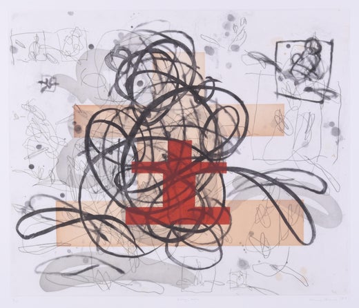
Hayes has traced the global extent of Bluemner’s intellectual indebtedness to Hegel (1991, pp. 36–37). More specifically, Bluemner made visual, in his art, the Hegelian world view, in the thesis and antithesis of the straight line and the curve, the red and the green, the vertical and the horizontal, the agitation and the calm. Bluemner respected all of these elements equally, painting and drawing the tension and dynamic of the dialectic and seeking ultimate reconciliation in a final visual synthesis. Bluemner was a keen student of art, past and present, looking, dissecting, and digesting all that he saw. He found precedents for his non-naturalist use of brilliant-hued color not only in the work Van Gogh and Cezanne, but also in Gauguin, the Nabis, and the Symbolists, as well as among his contemporaries, the young Germans of Der Blaue Reiter.
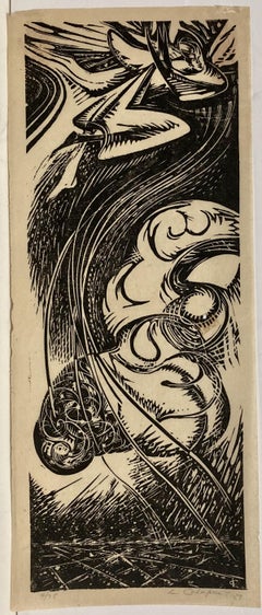
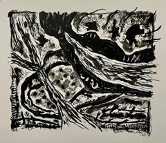
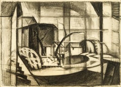
Bluemner was accustomed to working to the absolute standard of precision required of the architectural draftsman, who adjusts a design many times until its reality incorporates both practical imperatives and aesthetic intentions. Hayes describes Bluemner’s working method, explaining how the artist produced multiple images playing on the same theme—in sketch form, in charcoal, and in watercolor, leading to the oil works that express the ultimate completion of his process (Hayes, 1982, pp. 156–61, including relevant footnotes). Because of Bluemner’s working method, driven not only by visual considerations but also by theoretical constructs, his watercolor and charcoal studies have a unique integrity. They are not, as is sometimes the case with other artists, rough preparatory sketches. They stand on their own, unfinished only in the sense of not finally achieving Bluemner’s carefully considered purpose.
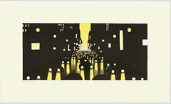
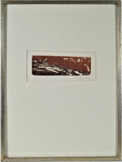
The present charcoal drawing is one of a series of images that take as their starting point the Morris Canal as it passed through Rockaway, New Jersey. The Morris Canal industrial towns that Bluemner chose as the points of departure for his early artistic explorations in oil included Paterson with its silk mills (which recalled the mills in the artist’s childhood home in Elberfeld), the port city of Hoboken, Newark, and, more curiously, a series of iron ore mining and refining towns, in the north central part of the state that pre-dated the Canal, harkening back to the era of the Revolutionary War. The Rockaway theme was among the original group of oil paintings that Bluemner painted in six productive months from July through December 1911 and took with him to Europe in 1912. In his painting journal, Bluemner called this work Morris Canal at Rockaway N.J. (AAA, reel 339, frames 150 and 667, Hayes, 1982, pp. 116–17), and exhibited it at the Galerie Fritz Gurlitt in Berlin in 1912 as Rockaway N. J. Alter Kanal. After his return, Bluemner scraped down and reworked these canvases. The Rockaway picture survives today, revised between 1914 and 1922, as Old Canal, Red and Blue (Rockaway River) in the collection of the Hirshhorn Museum and Sculpture Garden, Smithsonian Institution, Washington D. C. (color illus. in Haskell, fig. 48, p. 65).
For Bluemner, the charcoal expression of his artistic vision was a critical step in composition. It represented his own adaptation of Arthur Wesley’s Dow’s (1857–1922) description of a
Japanese...