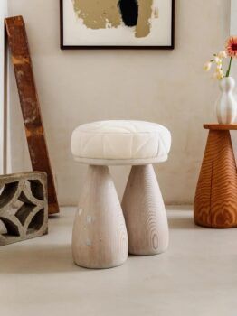
What does serenity look like? Everyone has a different answer, but in Pantone’s view, it is definitively a crisp shade of white. The international color authority announced this morning in a rather dramatic video that its 2026 color of the year is what some consider the complete absence of color. The hue, Cloud Dancer, is a slightly dusty shade of pure white. Heated reactions to the rather bland pick have flooded the Internet.
As the New York Times points out, white has a host of strong associations, from wedding dresses and baptismal gowns to cottage cheese and AirPods. But in its press release, Pantone emphasized that Cloud Dancer is intended as a “blank canvas,” encouraging the “quiet reflection” so lacking in our era of overstimulation.
The hue is not exactly “blank,” but it’s not particularly sexy either. Although the simplicity of white may very well counteract our current cultural anxieties — and we never turn up our nose at a well-crafted white room — we have to agree with the horde of Internet commenters that Pantone’s claim about Cloud Dancer’s redemptive power seems overblown, and the color itself a bit boring.
We’re willing to bet plenty of actual colors will soon have their day in the sun. According to our 2026 trend report, next is going to be very pastel friendly, with powder pink, cornflower blue and butter yellow expected to be among the top hues in interior design. If Cloud Dancer does become a go-to, these hues will certainly play nicely with it.